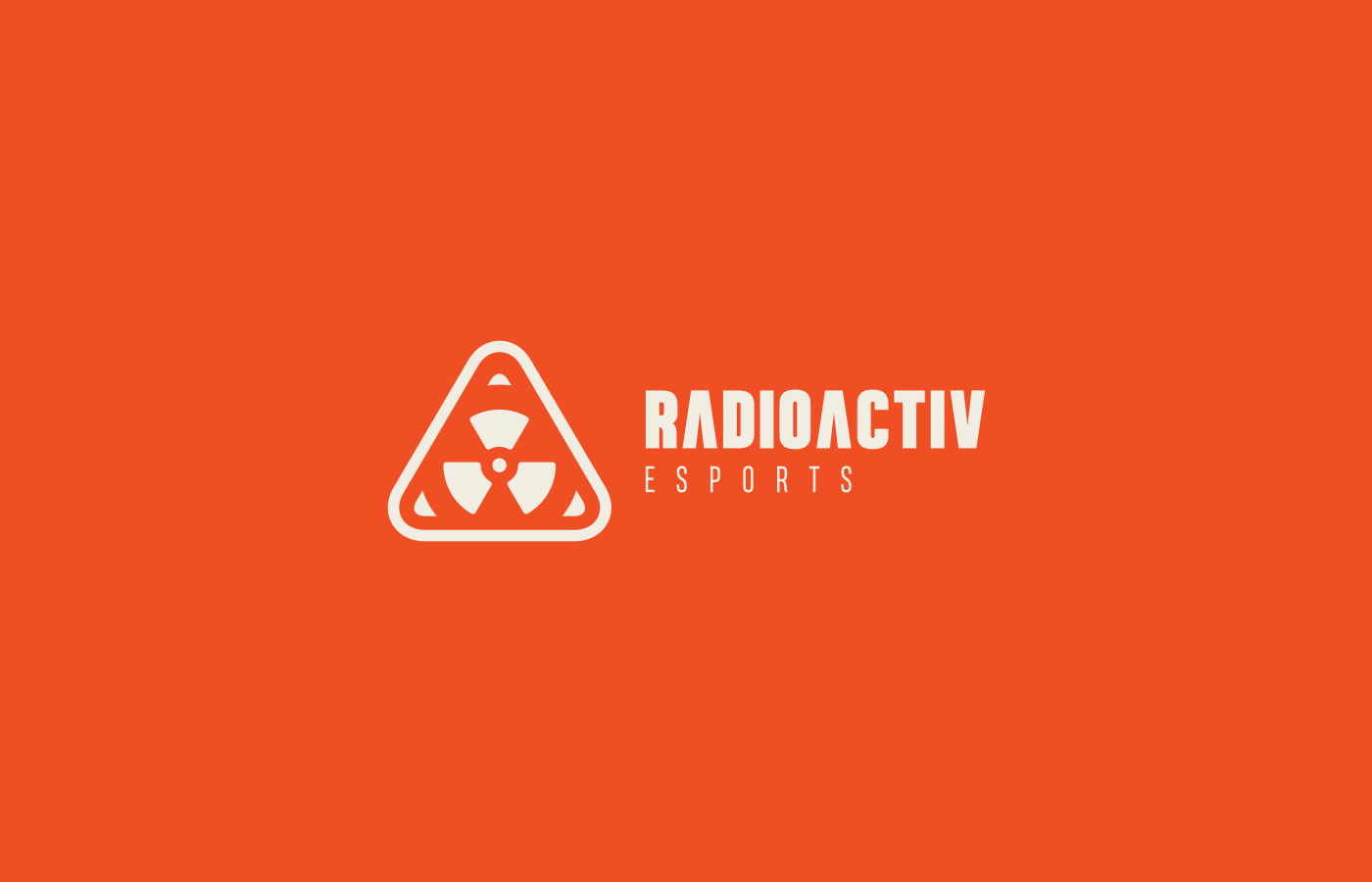


I was tasked by founder Erick Weinstetter to craft the identity for the launch of Radioactiv.
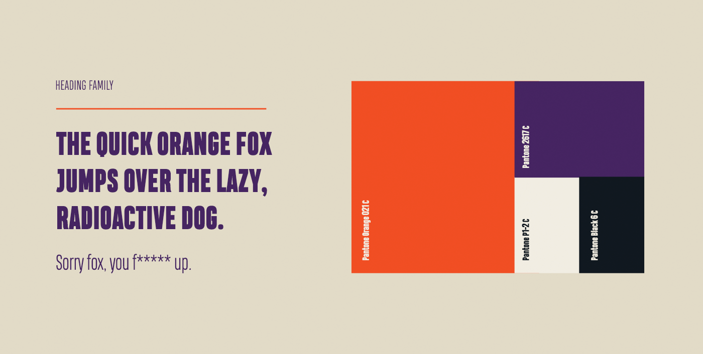
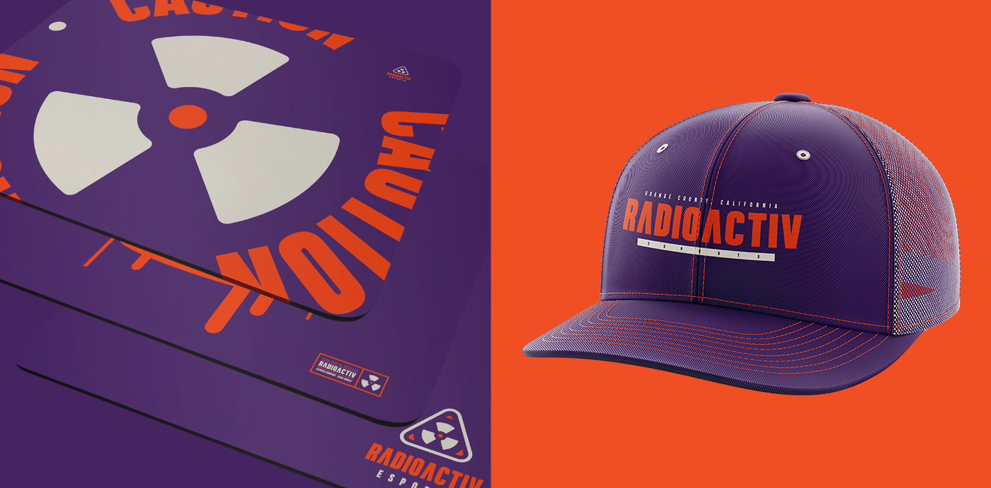
The goal: visualize "toxicity" and "danger" while strictly avoiding the standard yellow-and-black tropes. The result is a dynamic visual system that feels volatile, aggressive, and fresh.
The goal: visualize "toxicity" and "danger" while strictly avoiding the standard yellow-and-black tropes. The result is a dynamic visual system that feels volatile, aggressive, and fresh.
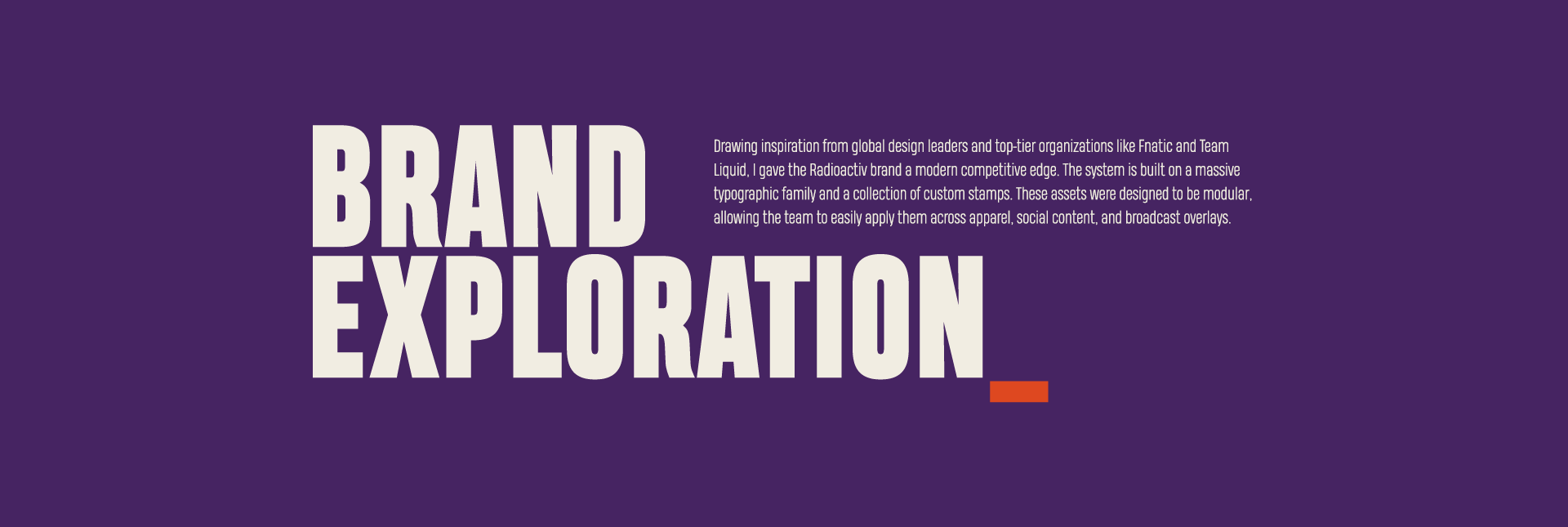
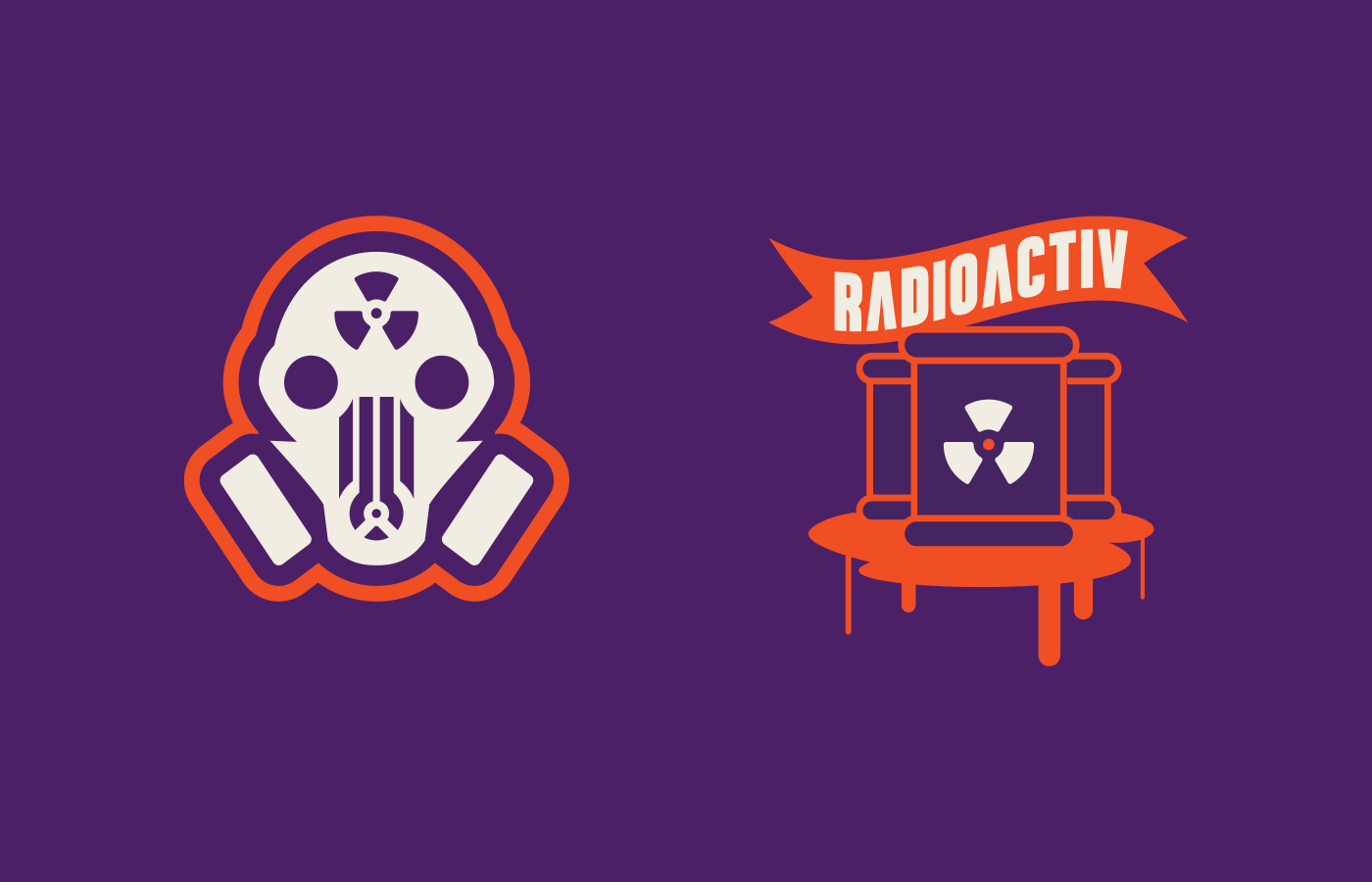
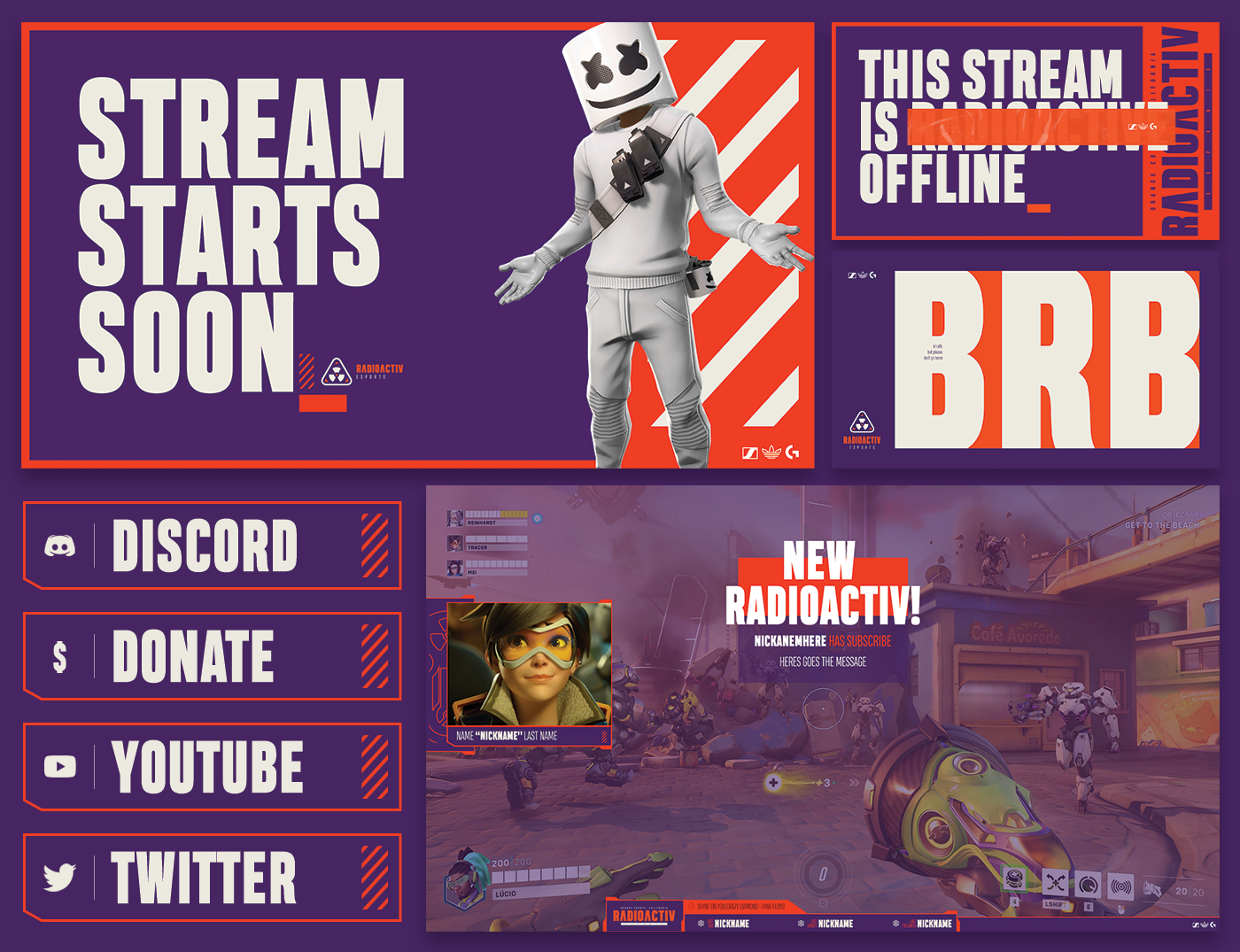
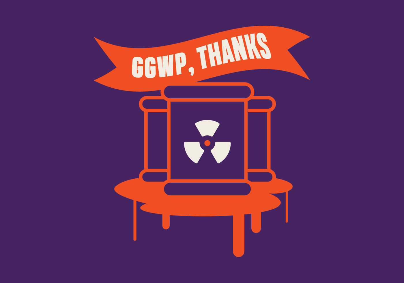
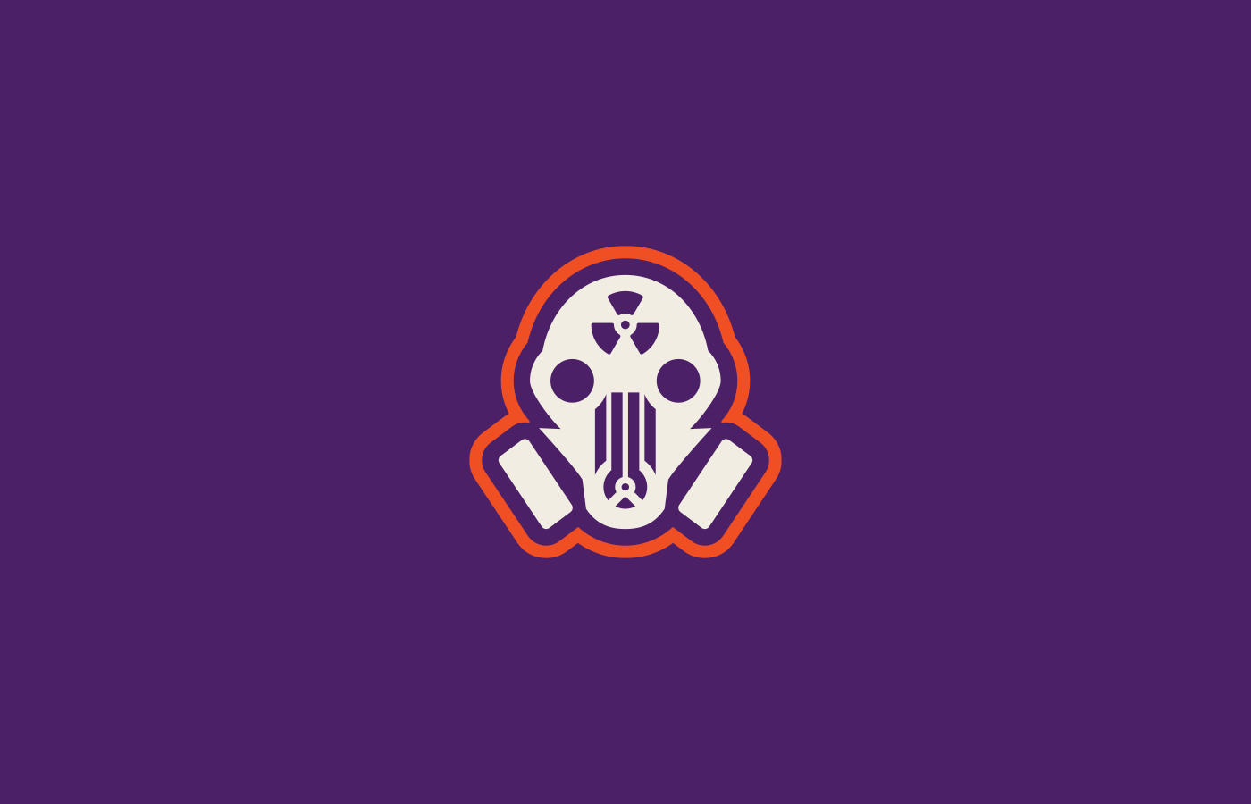
Visual Arsenal
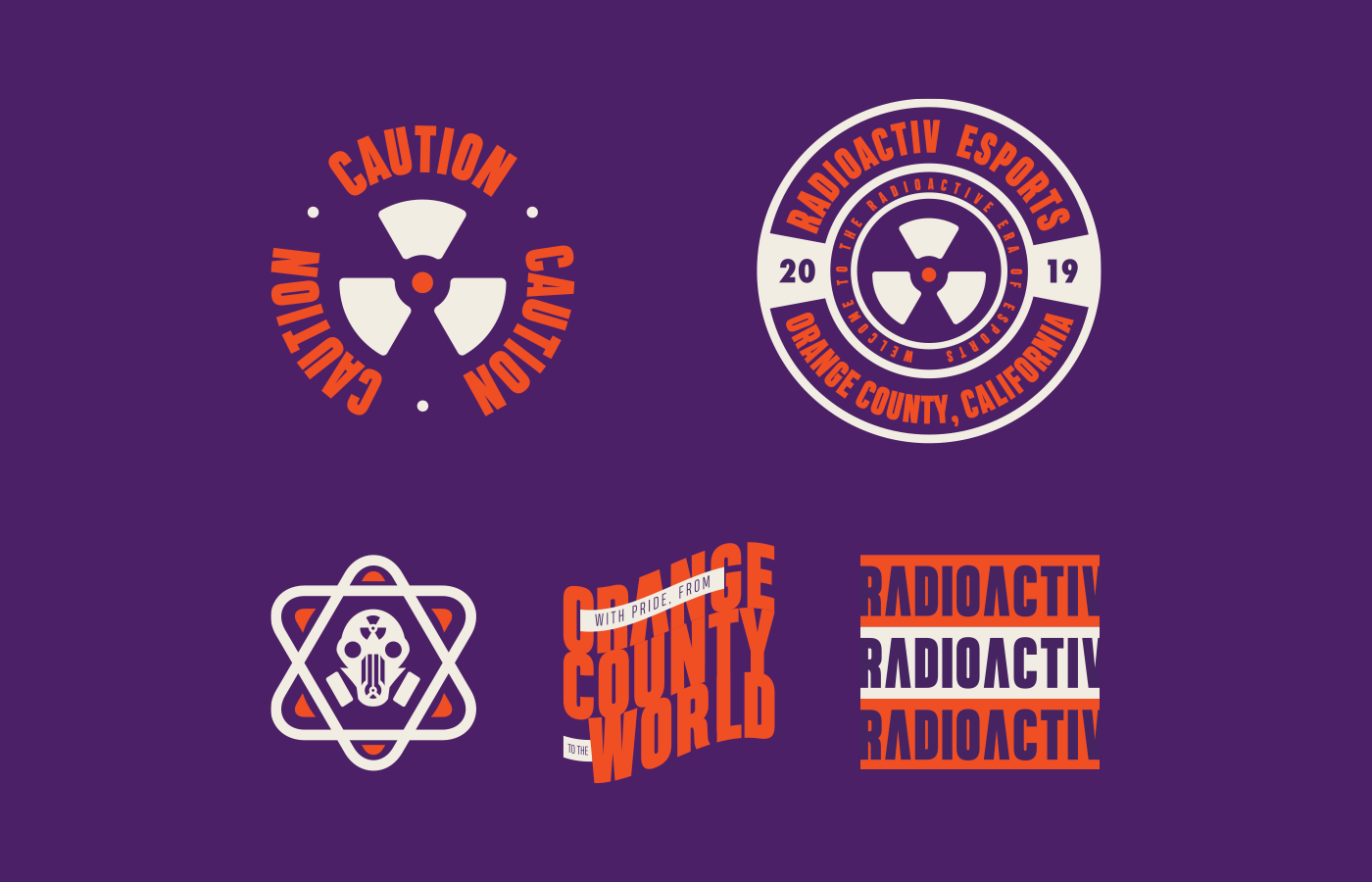
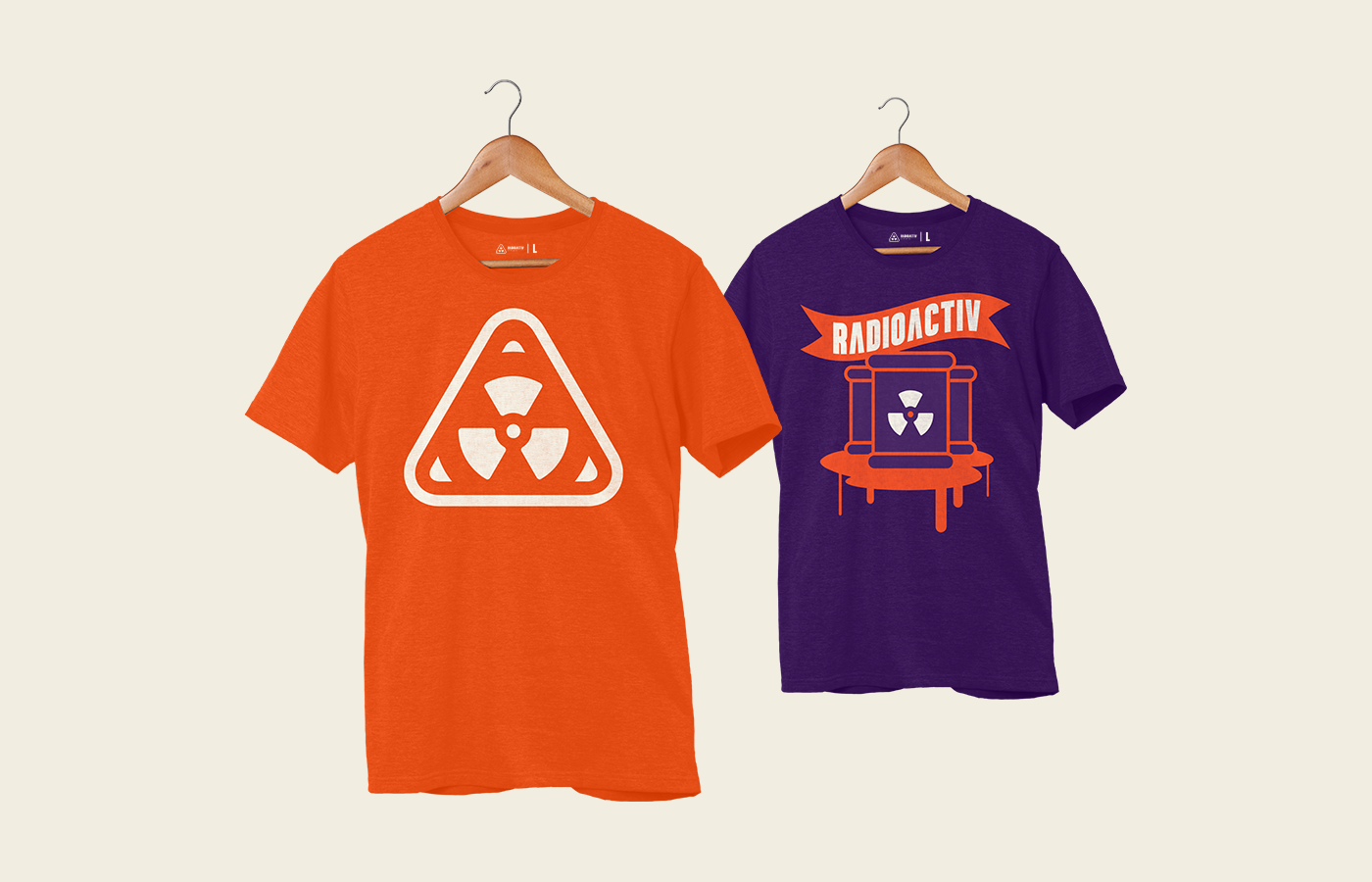
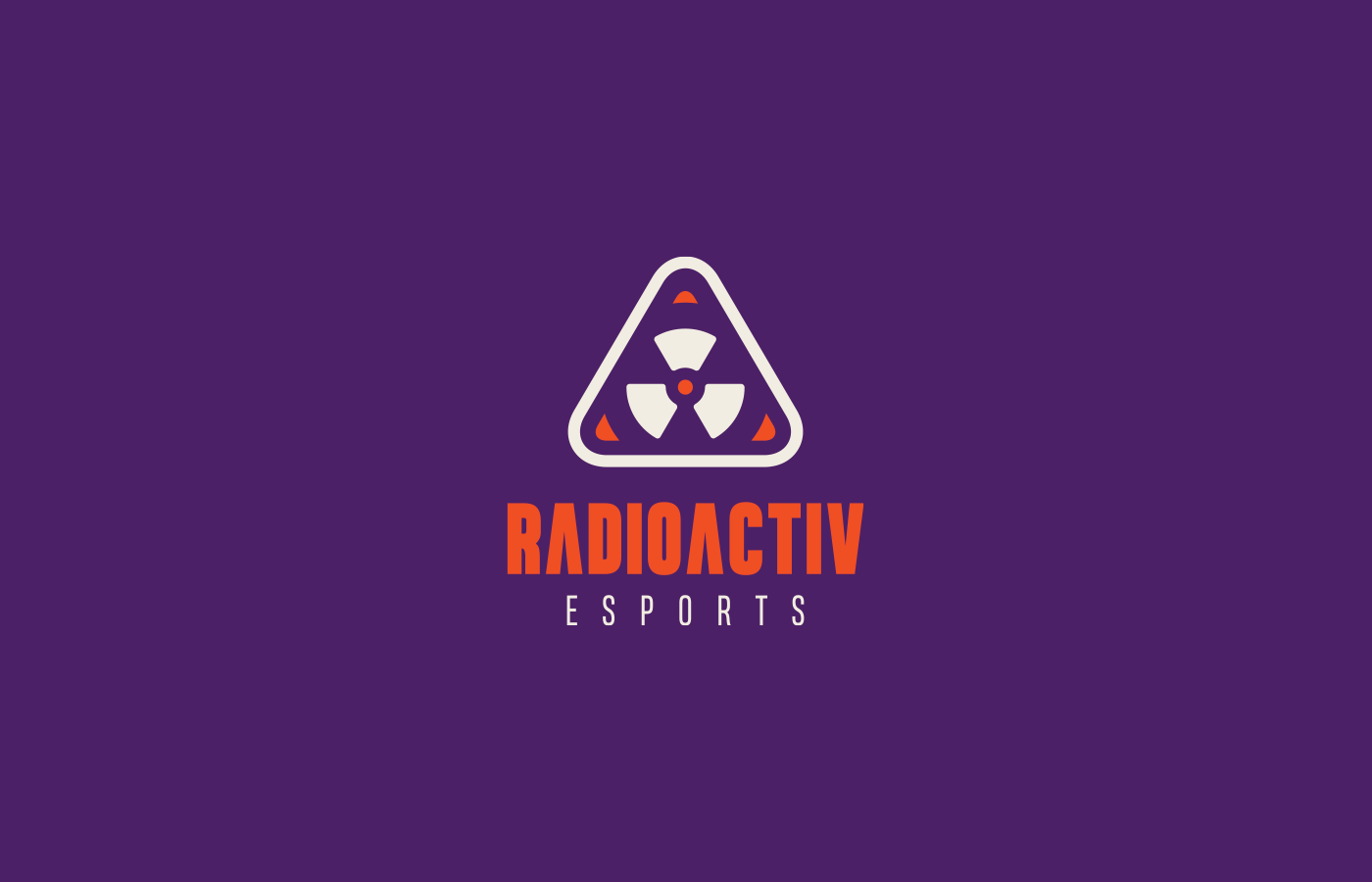
The Mark: A fusion of competitive energy and radioactive aesthetics. It is clean, vibrant, and packed with personality.
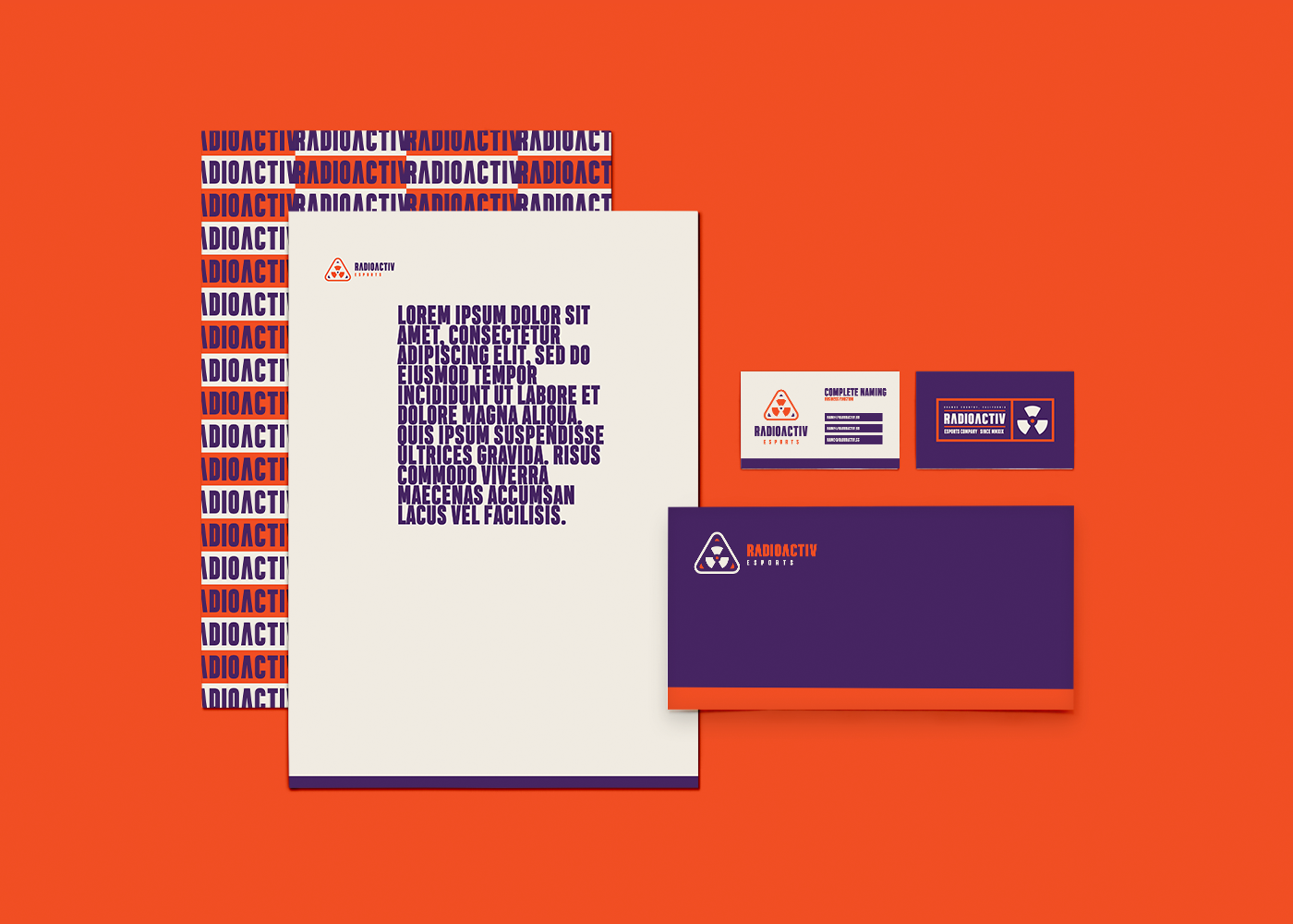
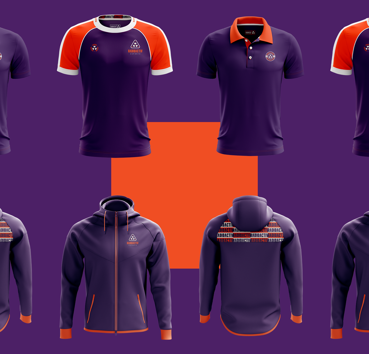
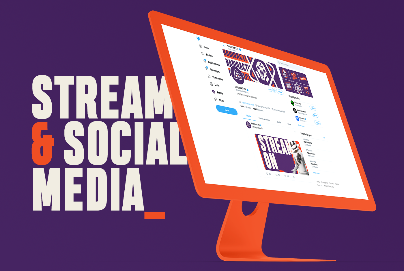
The System: Benchmarked against global giants like Fnatic and Team Liquid, the identity focuses on versatility.
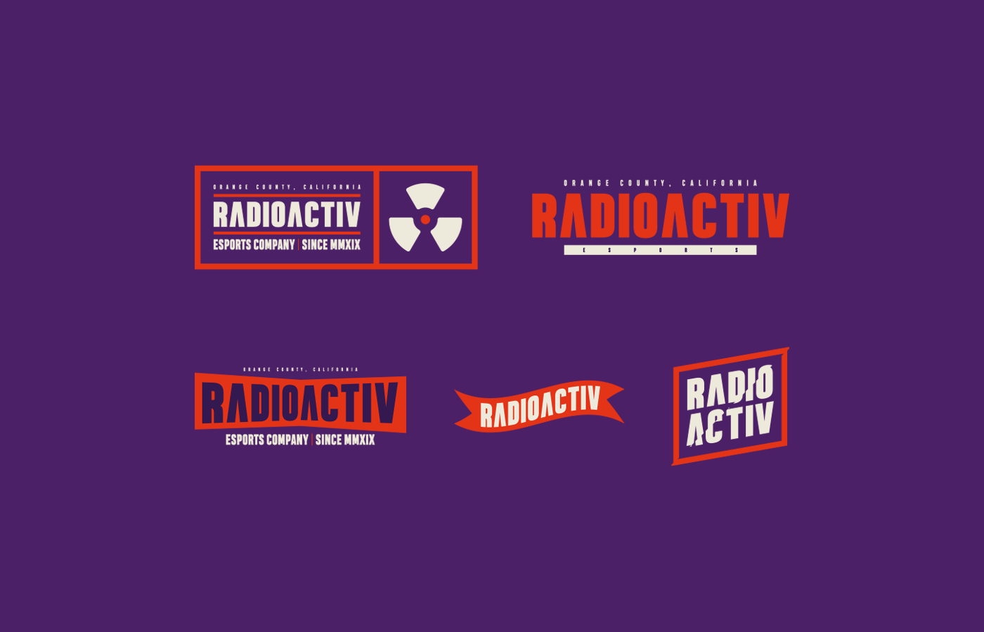
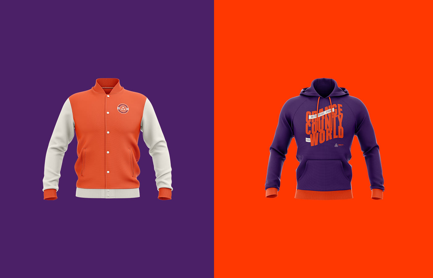
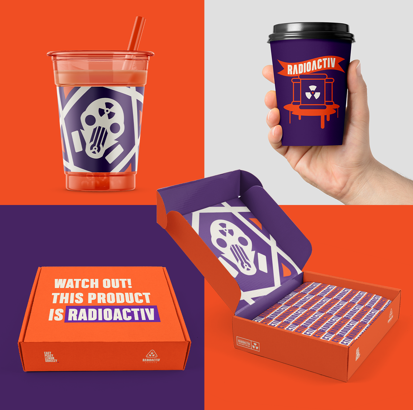
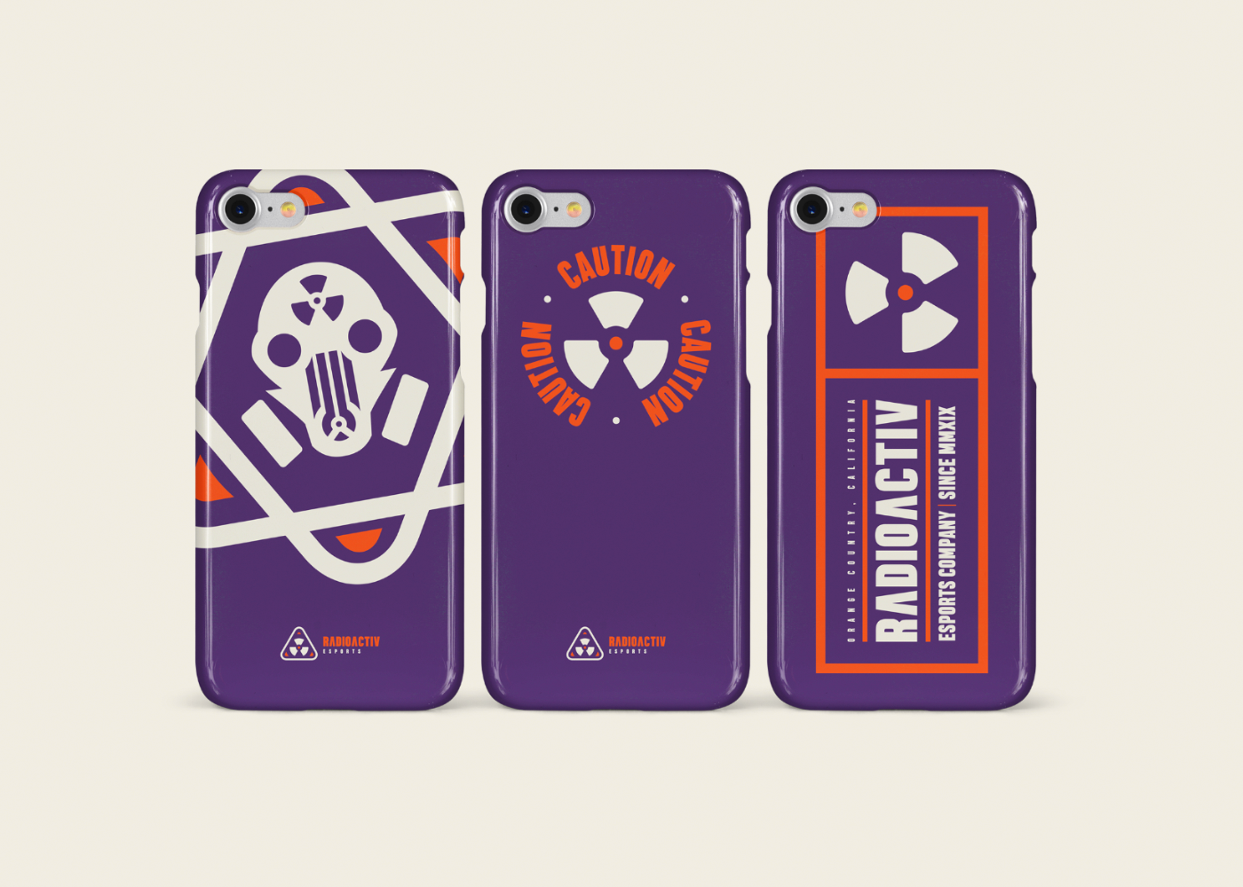
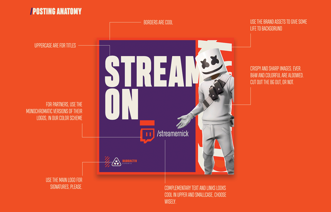
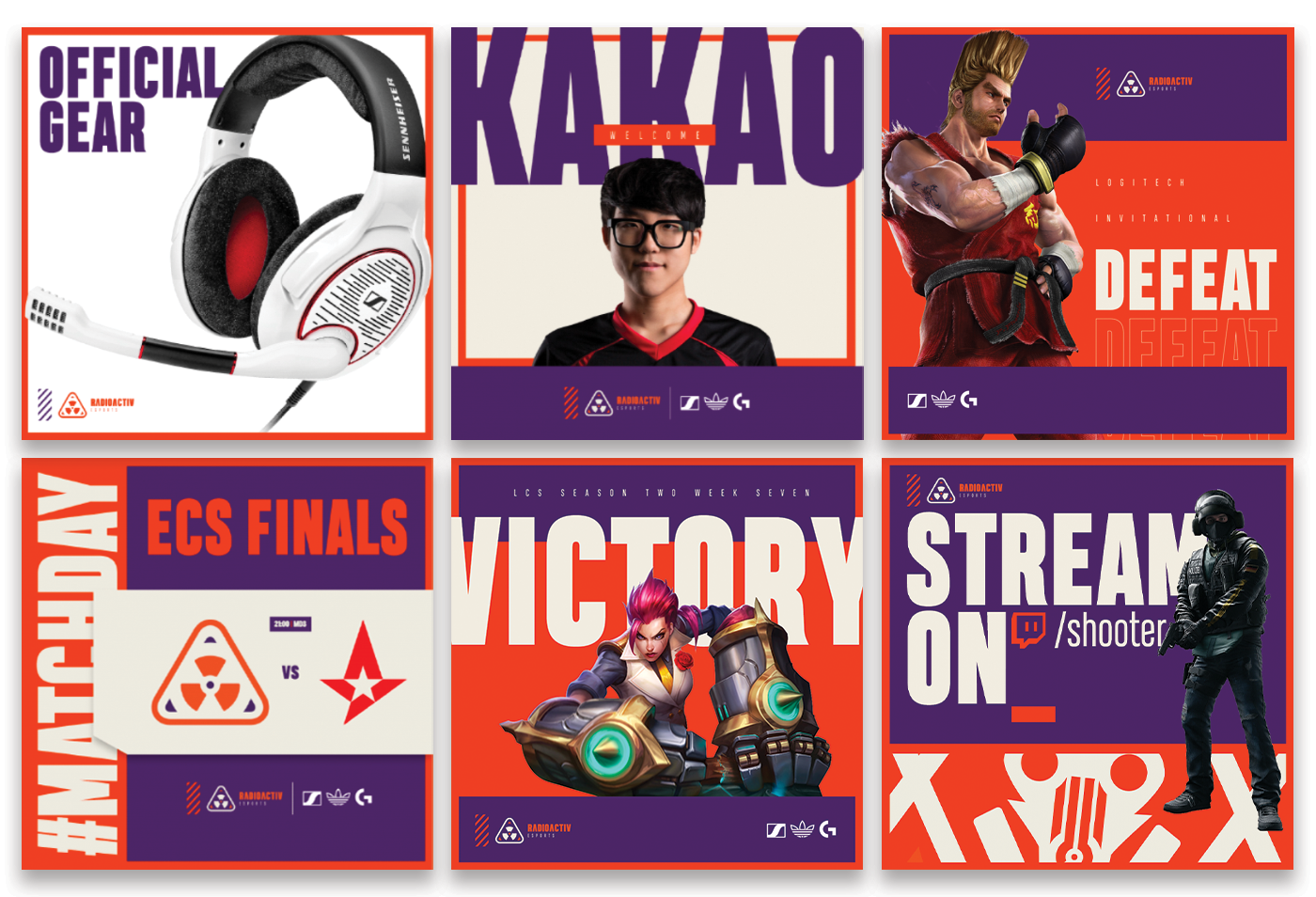
The Toolkit: A massive type family and a library of custom badges allow the brand to scale effortlessly across merch and digital content.