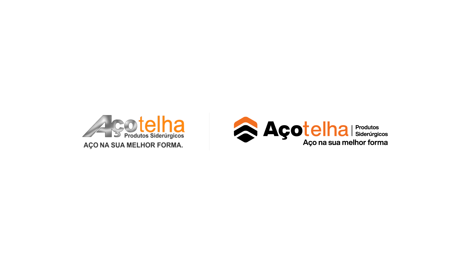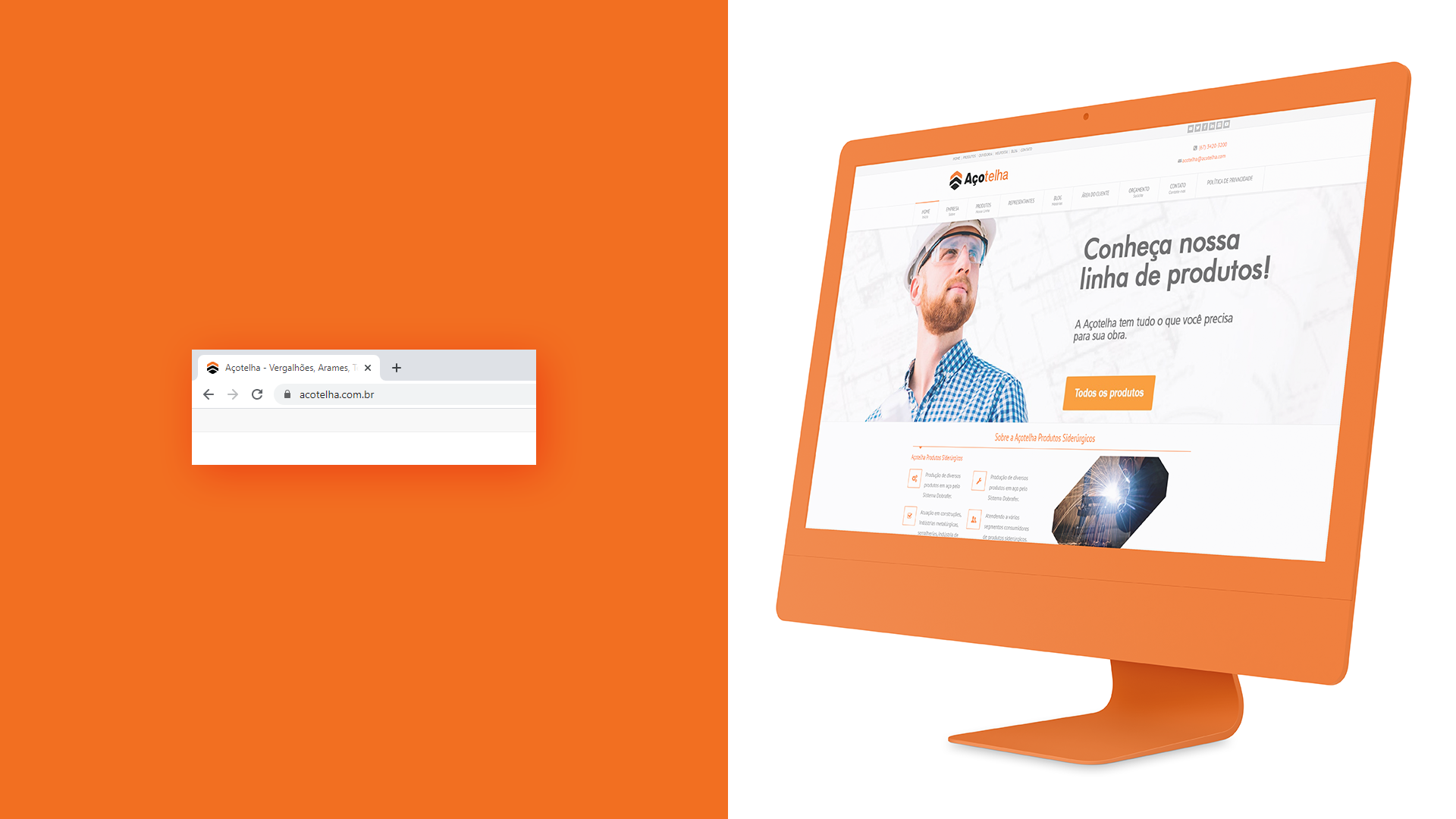


Açotelha is a regional leader in the steel industry, serving both B2B and B2C markets. The launch of a new, high-tech industrial unit in 2021 sparked the need for a visual update.
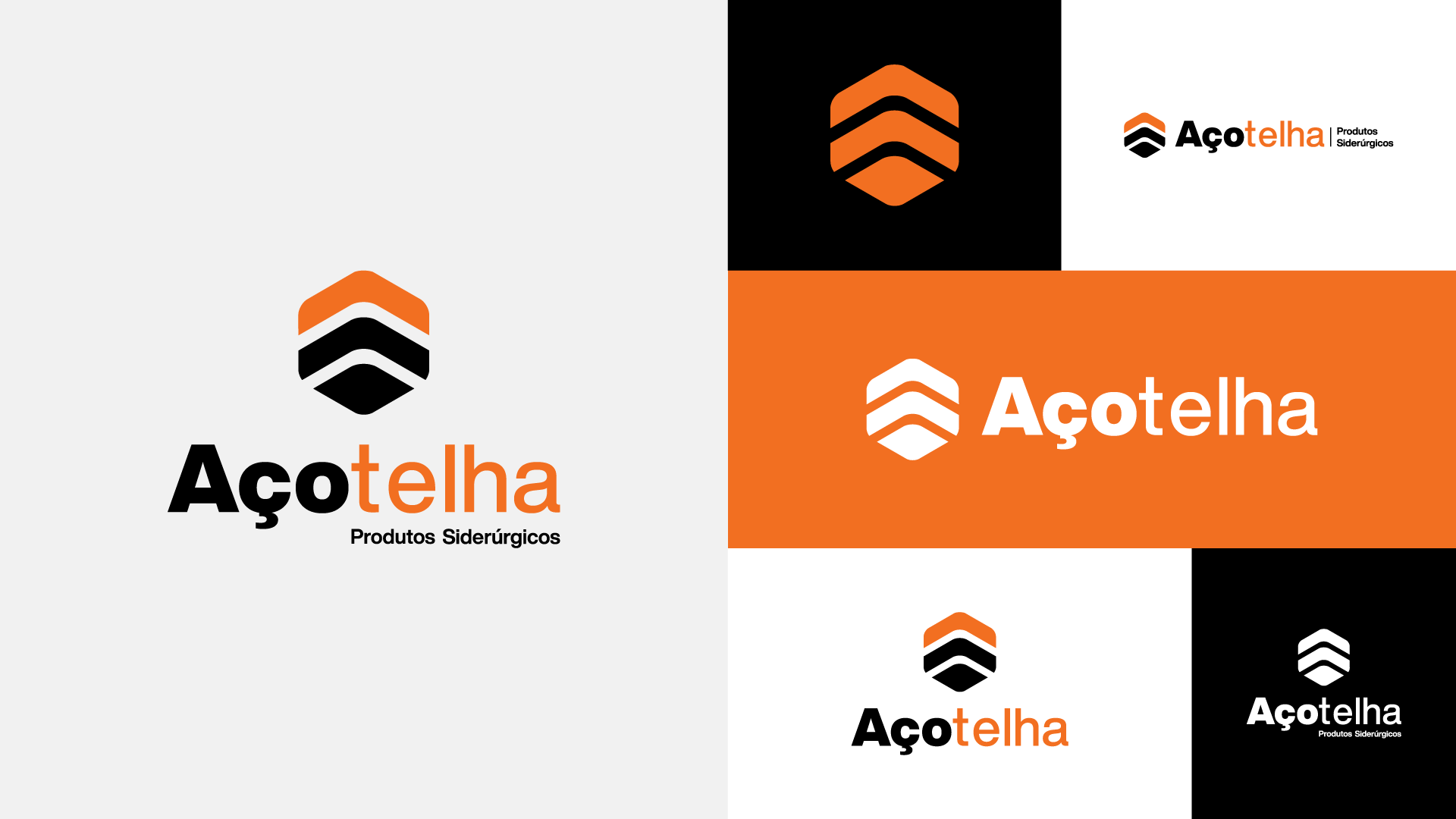
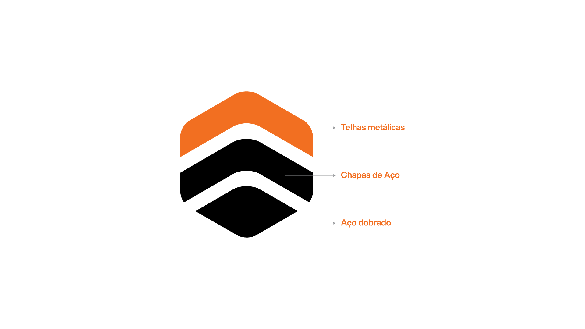
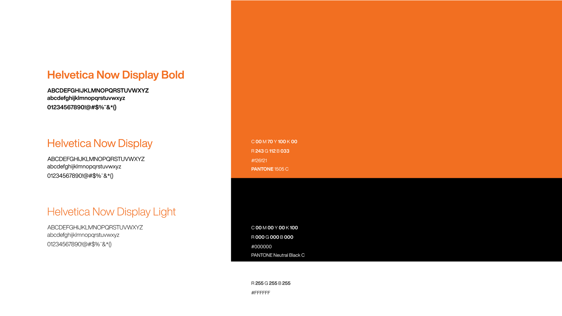
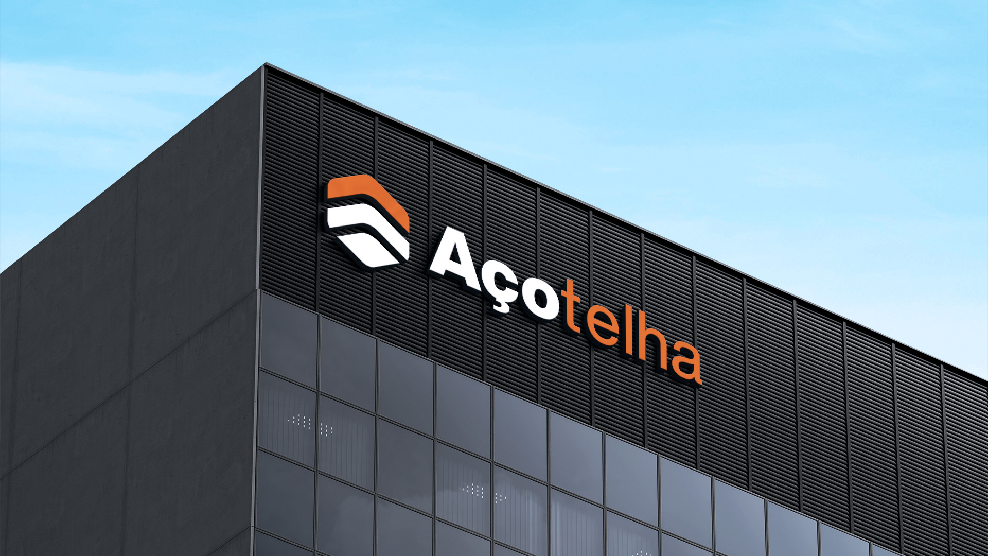
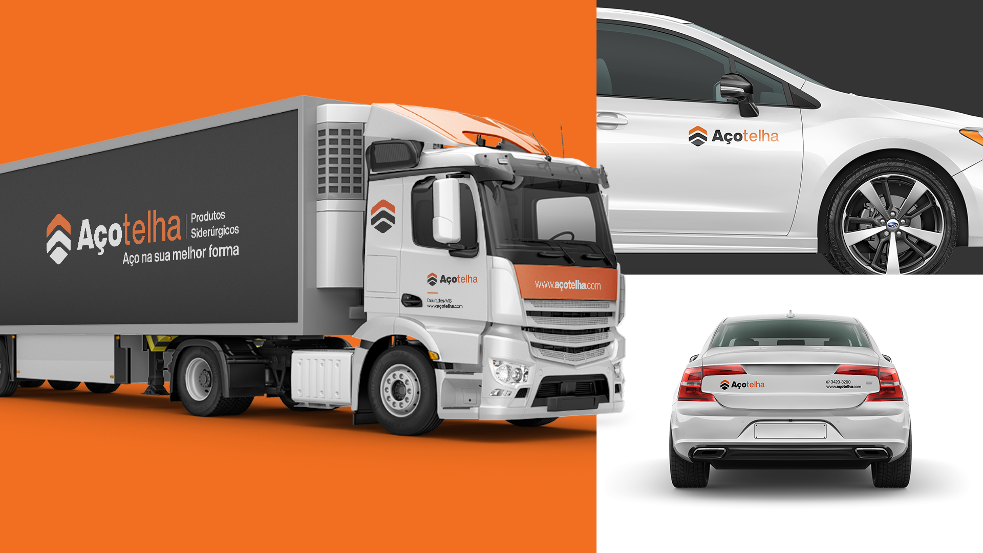
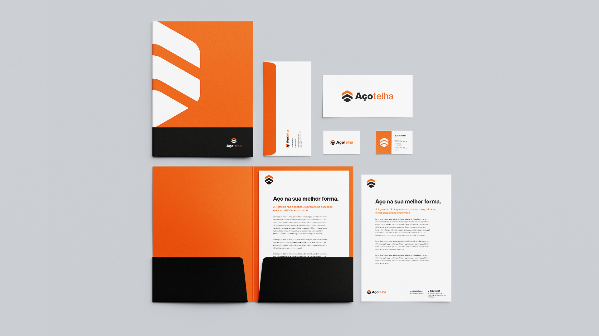
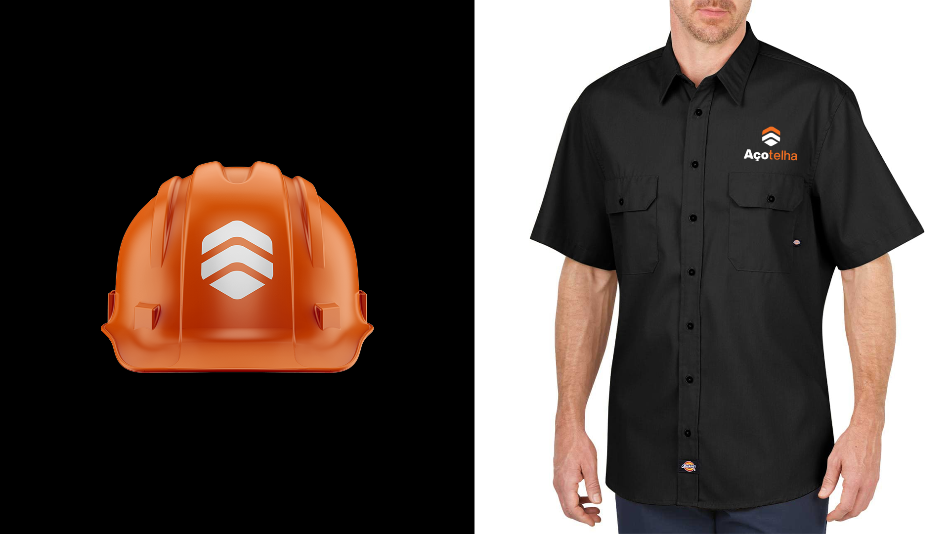
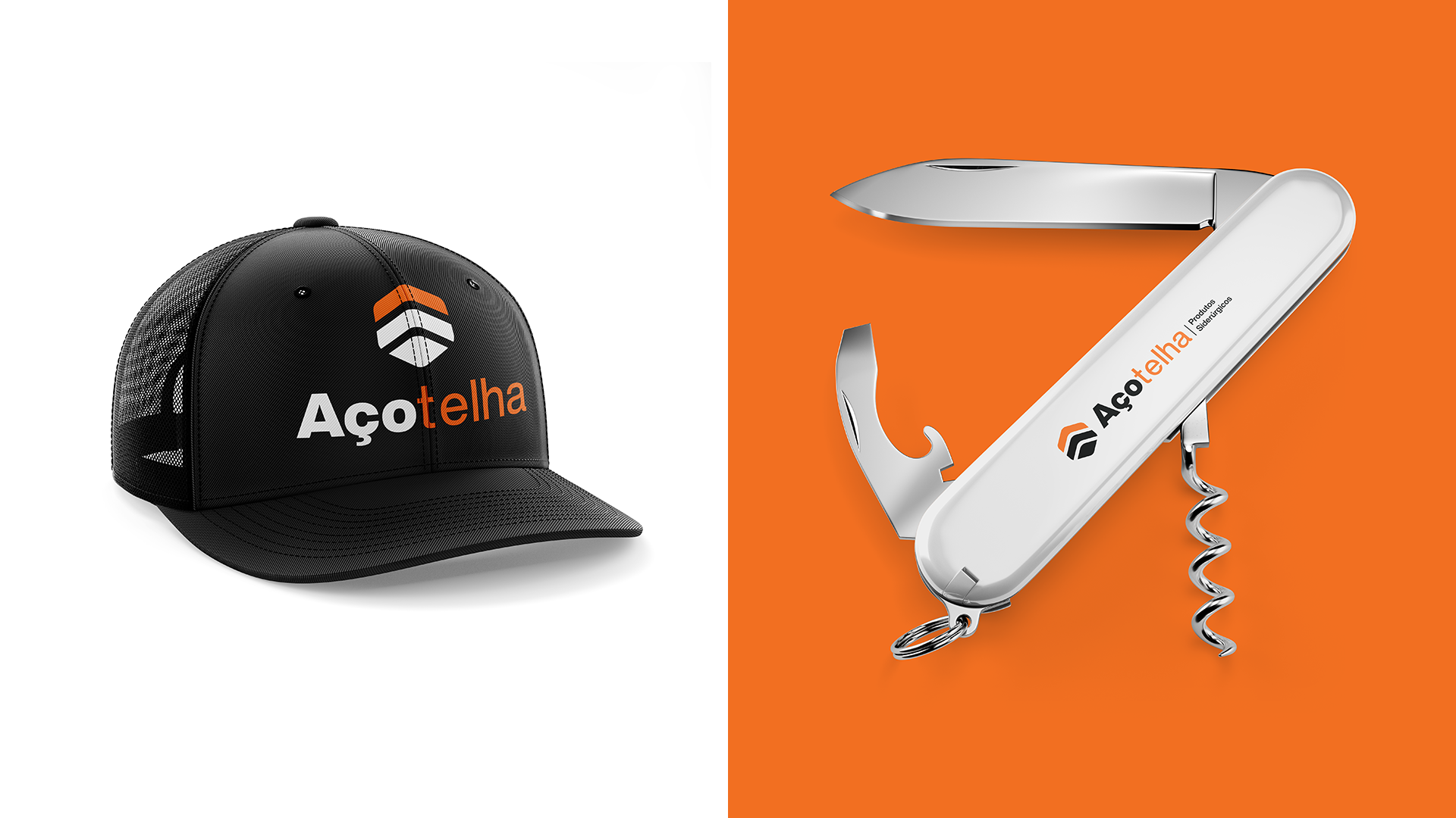
My main challenge was to distill the brand into a single, concise symbol. I chose to evolve rather than destroy—keeping the foundational structure while modernizing the colors and typography. The result is a visual identity that is strong, modern, and malleable—capable of adapting to any situation, just like the steel they produce.